instagram linkedin
office

brief

Hard to book

Due to the hybrid work system, the office needed an efficient tool to enable employees to quickly book desks. The application made earlier using powerapps did not meet the users' expectations due to the way it works. My job as a team member was to design a application that was easy to use.
* I worked for Jacobs while designing this application. I was part of a team entrusted with UI / UX functions. I joined a front–end developer and two backend devs.

problem

Ambiguities

The older application was in use for several months, which made it possible to obtain a large number of opinions on its operation. In addition, I booked a desk several times to check how the goal is achieved with its help.

  • the application does not guide the user step by step
  • no clear information on what is and what is not interactive
  • unnecessary additional options
  • very slow operation
  • the application is not responsive
  • misleads the user
a guy who gets nervous and sweats

goal

Easy to book

Several requirements were placed on the team. The application should be quick in action and easy to use. The user is to be able to book a desk for one day at certain times or for several days. Desks can only be reserved two weeks in advance.

how to pick single day in app

solution

Interface

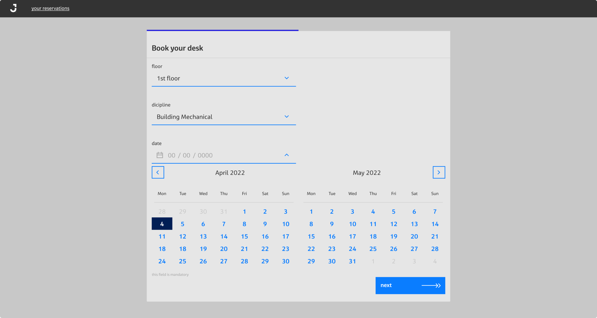
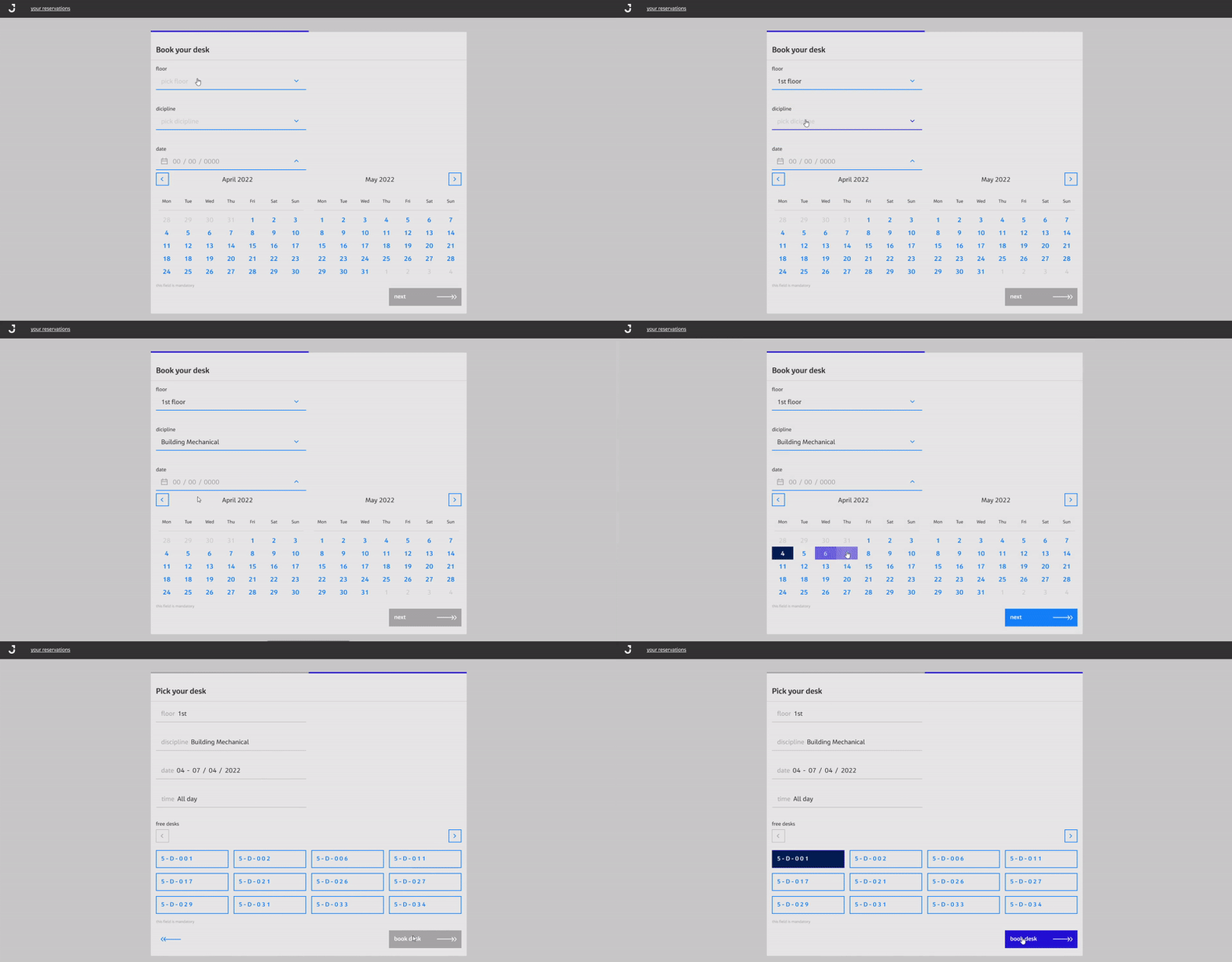
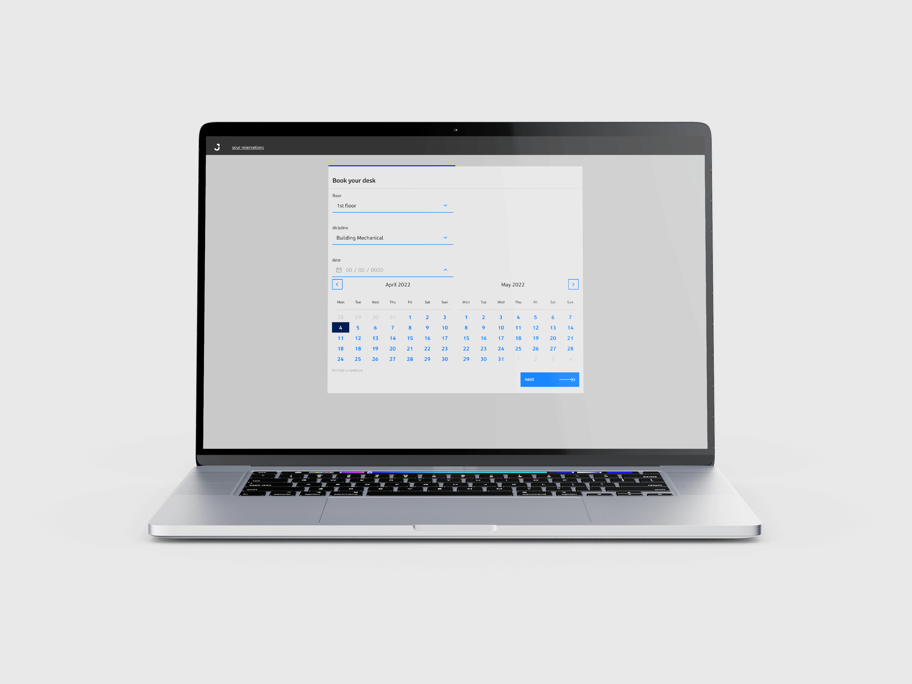
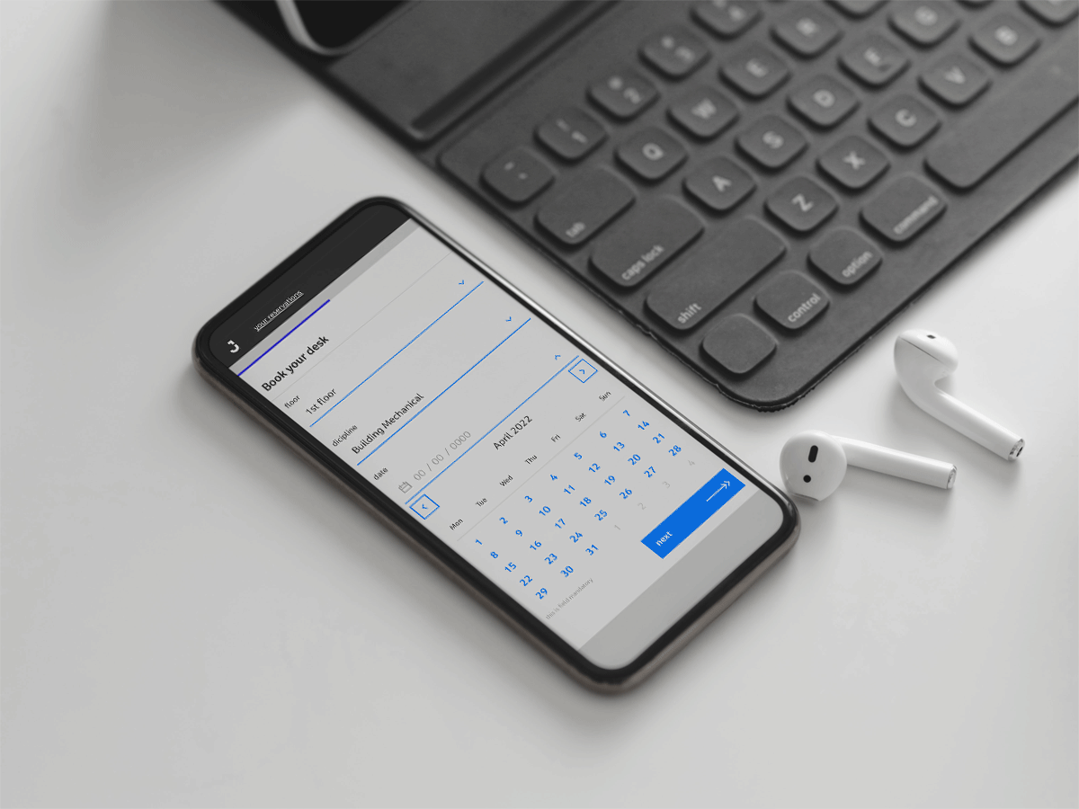
The application is divided into two steps and guides the user through the sections that must be completed in order to proceed, based on the standards of form design. In the beginning, the user has to select the floor, discipline and date of the reservation. Then chooses a desk from the available ones. After making a selection, the application informs about the reserved desk.

steps of booking app

01

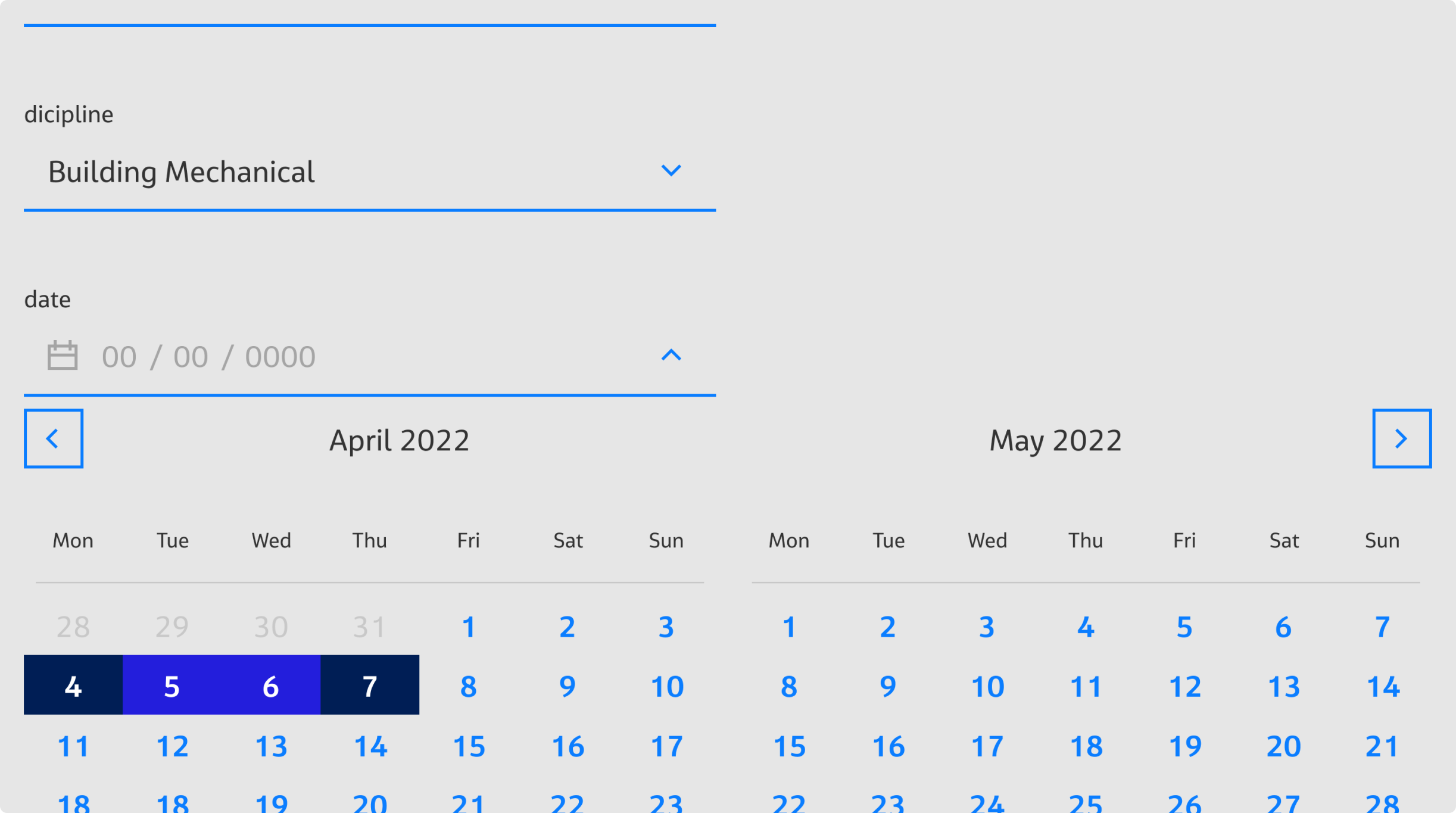
The calendar works similarly to calendars for booking flights or hotels known to users.

booking app calendar

02

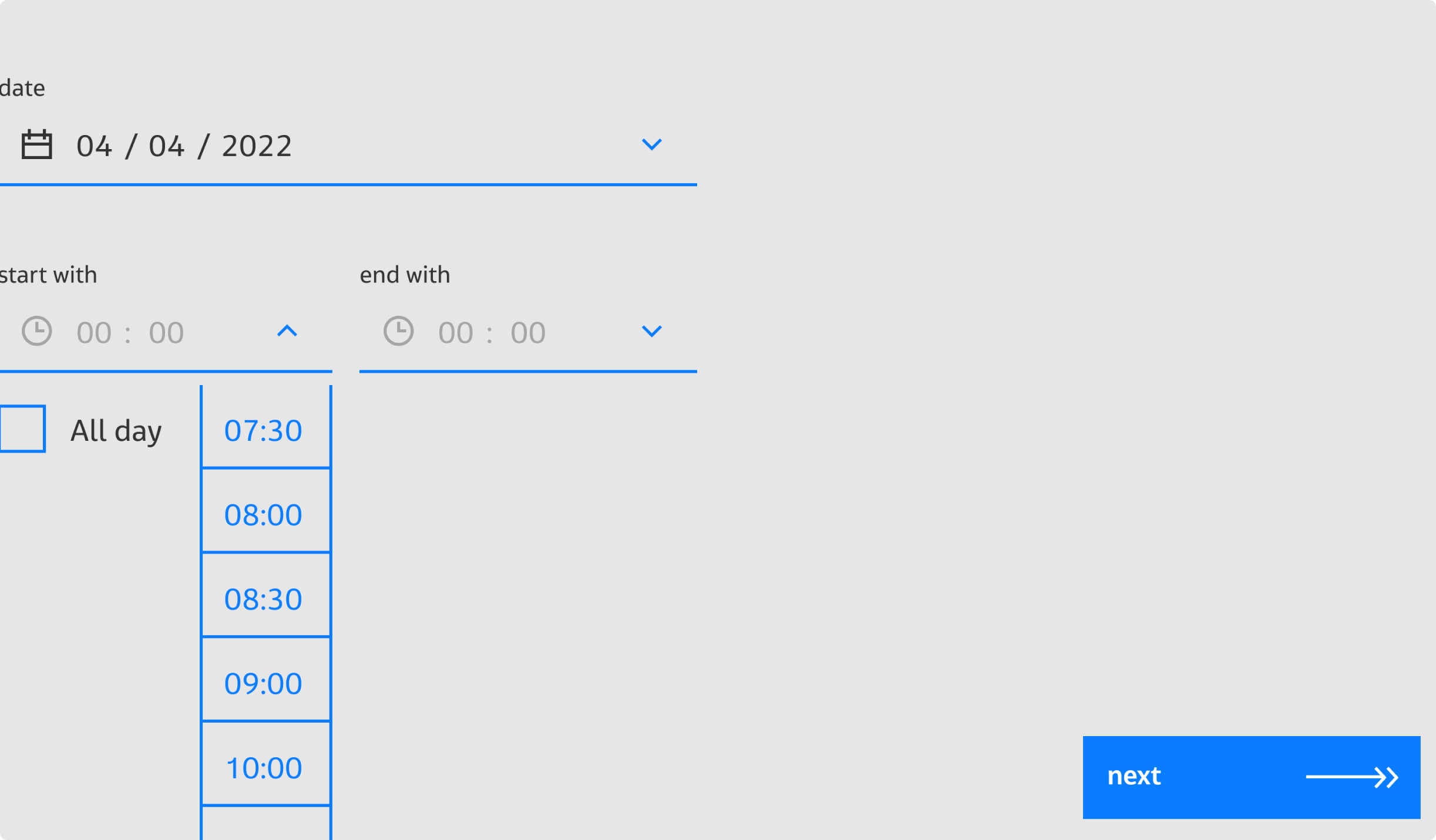
when we want to reserve a desk for one day, the user has the option of booking a desk for a whole working day or just a few hours.

hours picker

03

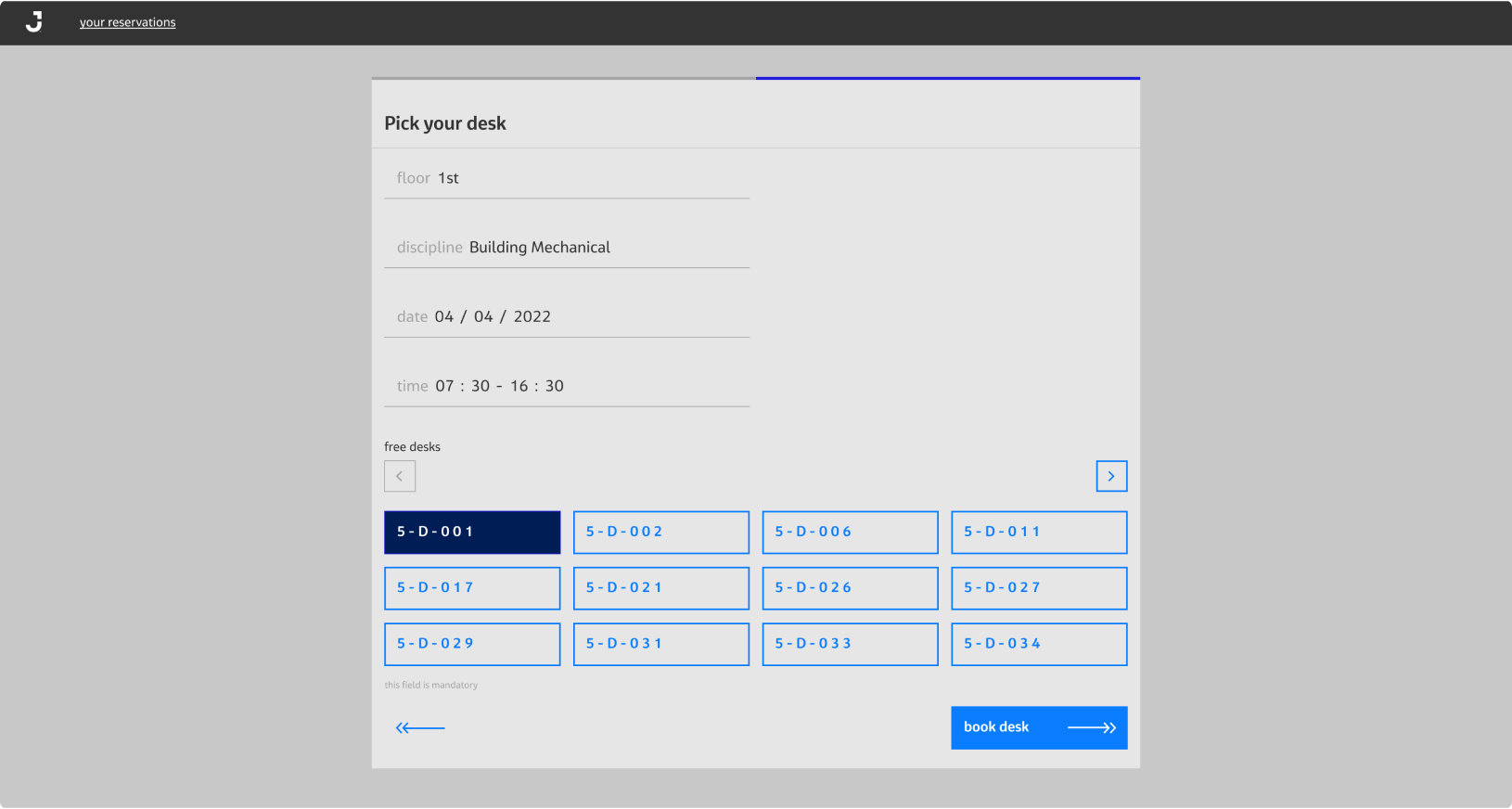
in the second stage, the user receives a confirmation of his choice from which he can withdraw.

desk picker

04

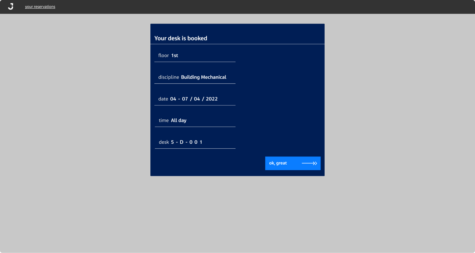
At the end, a confirmation message is displayed, the user will also receive an e-mail with similar information.

desk booked screen

next step

Tests with users

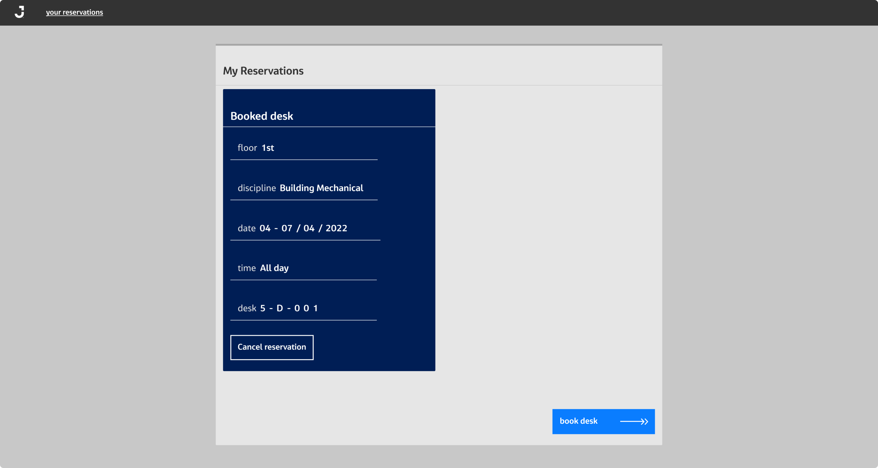
After creating a working application based on the prototype, we tested the application with users. Users had to perform one of two tasks. This allowed us to find potential bugs in the user path. They had to reserve a desk for one day for a short period of time or for several days. None of the users had a problem booking a desk. However, in the final stage, changes were needed to make it easier to view your reservations, add new ones, or cancel them. The appearance of the top navbar was dictated by the intranet ui. Users did not notice the option to see their bookings.

your reservation screen

last changes

Solution

In response to the problem, after clicking "ok great", the user goes to the current reservations, where it is possible to cancel the previous reservation or reserve new ones.

comment

In my opinion

Finally, another function has been added to the screen where the user picks the desk number. It allows viewing the map with the location of the chosen desk. However, I believe that, without good wayfinding system in the office, such help may be of little value.

single day screen desk booking app on mobile