instagram linkedin
roadsigns

The Concept of new signs concerning for local Polish roads.

brief

Introduction

The Polish road sign system has been revamped and became standardized and implemented as new in 1975. The Project was commissioned by Poland’s Ministry of Transport. Since then the Ministry has introduced only minor changes. The Signs are based on pictograms and the typeface designed by Marek Sigmund. The typeface was designed so that it could be easily reproduced by hand. But there are many problems including the lack of optical corrections, a small x-height and Polish diacritics that are hard to recognize. The designers of the original system were not able to anticipate the tremendous growth of the road system as well as the increase in the speed of traffic in Poland during the next four decades. The next problem is that signs nowadays are designed by engineers and lawyers who use computer programs to generate the signage system solutions for particular roads, as a result, it can cause problems and a lack of consistency on roads which is confusing for drivers (Jerzy Gruszczyński 1-2/2011, pp24- 27 MagazynAutostrady, “Inwestycjesektorapublicznego, Oznakowaniedróg – prawo a praktyka” ).
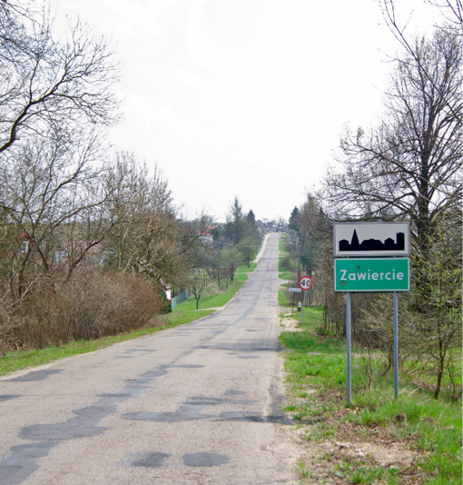
zawiercie roadsign
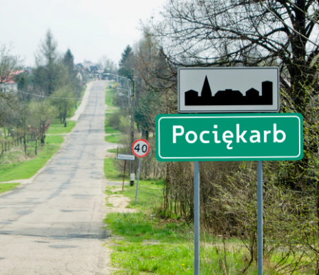
The current sign E17a marks the entry point to the city.

discovery

Aims

  • show how the signs work now.
  • what are the problems of polish local signs
  • what are the typeface problems
  • find other crucial problems of Polish signage

discovery

About tests

The street, where the sign was situated, was straight for about 600 meters after that it was a turn that marked the point from which the participants started driving. All of them did not see signs before tests and their first eye contact with the name on it was on this straight part of the road. Names of the cities were typeset with four different typefaces which included the current one. There were four signs with different town/cities names on them.
I choose the names which start with the same letter and based on the part of Poland with which participants were not familiar. I wanted to avoid the situation in which, after the first sign participants will be familiar with the name and they will stop reading and start assuming based on the shape of the word itself. The prepared signs were the same size as the current ones, and all of the chosen fonts had the same x–height. The background of the signs was white and the letters were black because I wanted to find an optimal typeface and size of the typeface.

discovery

Test

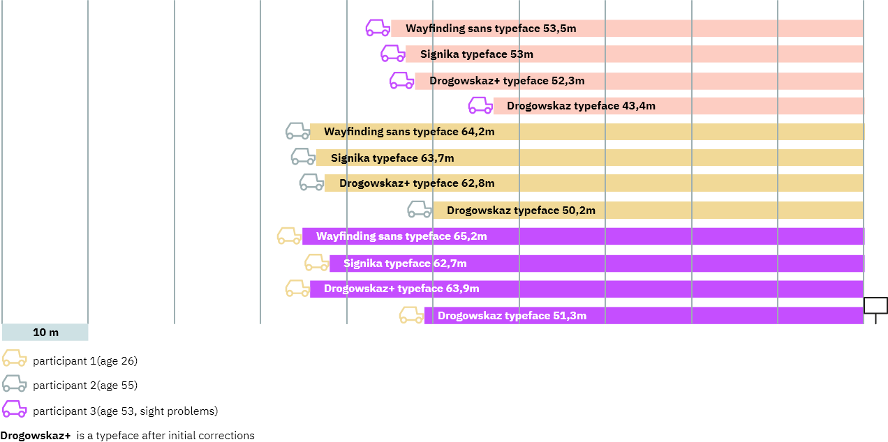
In the first test, I asked 3 participants (The participants were recruited from friends and family and all had a driving license) to drive from the earlier established point. point to the place where the sign was situated. They needed to drive a car with a maximal permissible speed of —50 km/h. They were also asked to stop the car at the moment when they could read the sign without any assumptions about what letters are on the sign, they had to see all of them.

infographic showing test

discovery

The current signage

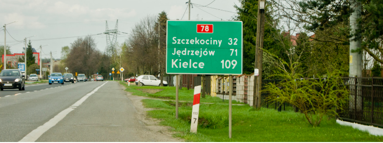
Additionally, in my opinion, another huge problem of Polish signage is inconsistency or the lack of it. Around the place where I live I could find many things which occur only in one place or the same signs which look different in different places. The first thing which can be found everywhere is that the signs use arrows to show a destination but also the signs themselves are arrows (the shape), even one case, after this kind of sign driver can be confused if it means something or it is that shape is a mistake. The next problem is that some signs are considerably bigger than other signs without any logical reason. That fact can provoke confusing situations for people who do not live in this region.

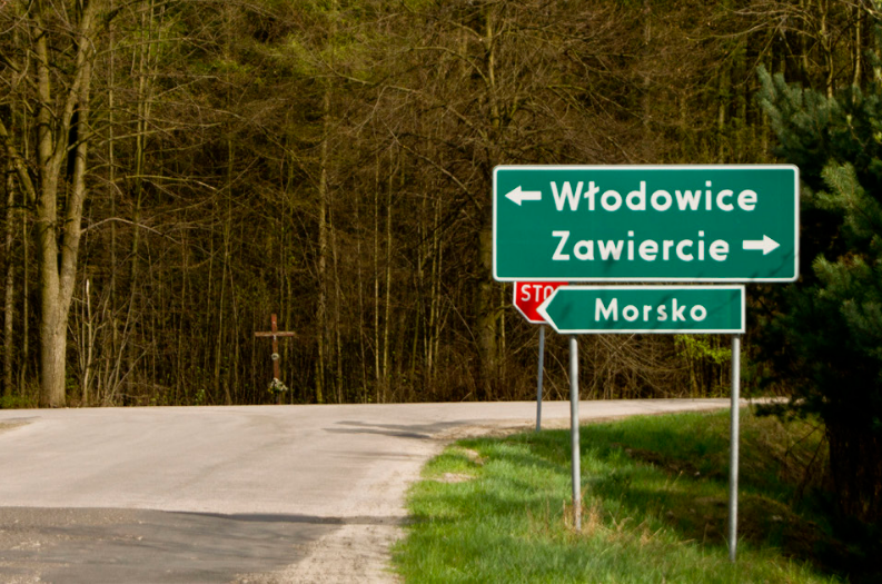
current Polish roadsign
On this sign, we can see two solutions of pointing to the destination. By arrows on one sign and the second sign is an arrow in its shape. Morsko is not smaller than Włodowice, but it is smaller than Zawiercie so maybe Włodowice and Morsko should be shown similarly.
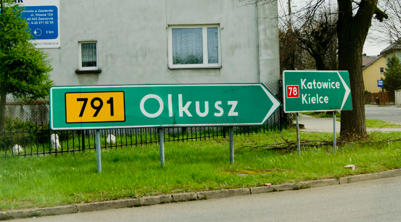
current Polish roadsign
Olkusz is smaller than Katowice but the sign is 3 times bigger than Katowice/Kielce. Probably this is a problem of authorities and lack of modules base on signs.
current Polish roadsign
Another problem is the differences in arrows on signs. Sometimes they are chamfered sometimes they do not.
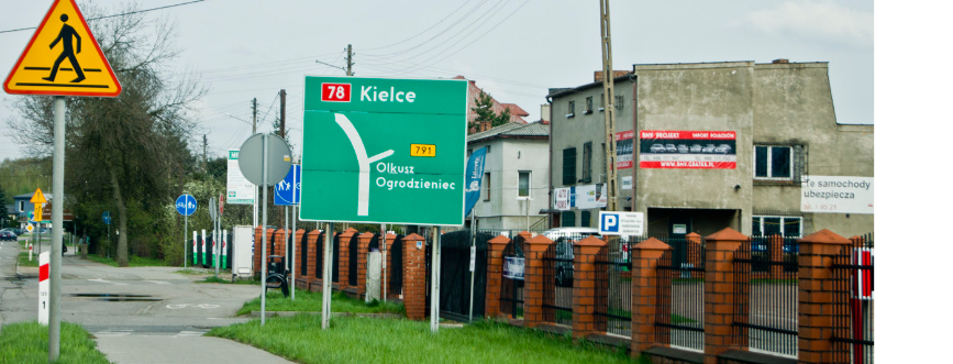
current Polish roadsign
Problem with hierarchy. The biggest city is last in a queue and the name of it is bigger than the others.

discovery

Summary

  • the current system typeface has big problems with diacritics which are not visible from a further distance
  • properly designed typefaces and current the one with some corrections gives similar results
  • black letters on white background have the best contrast but need more spacing than other colour solutions like white letters on green background
  • the current system uses two kinds of arrows which are not very legible and not adjusted to ISO7001

Signs changes

Typeface

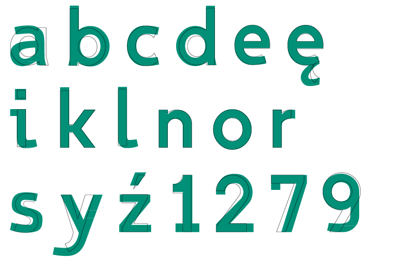
Because the new typeface on signs could confuse the drivers and also because my research shows that after improvements in the current typeface I could increase the legibility I decided to stay with it and continue my redesign. I am not a professional type designer and I do not have any experience in that field that is why I redesigned only several letters which I need to redesign picked earlier signs. I started with changing the spacing of the typeface which was too narrow and could affect the legibility on a longer distance. Secondly I changed the x-height of the typeface by modifying the capital letters size similarly to J. Montalbano who pulled up the height of the lowercase letters bringing them almost to the same level as the height of the capitals when he was designing a font for Forest service. Because of this he increased the legibility in comparison to the previous typeface and took up 15% less space on the sign itself.

improvements letterforms
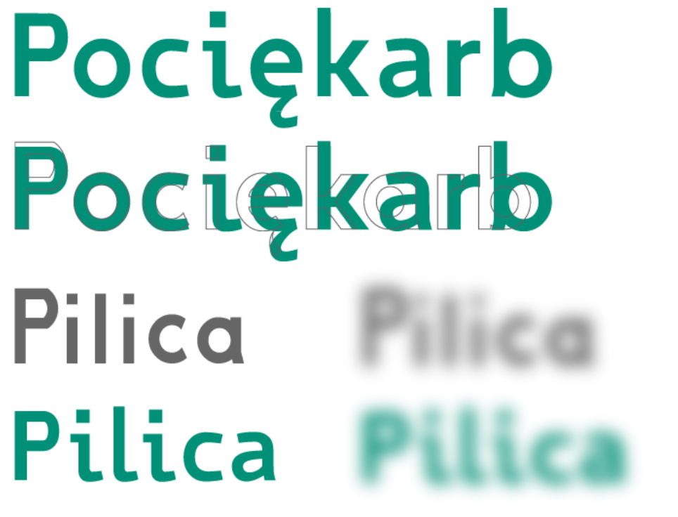
Comparison of individual letters from both typefaces (green is a corrected typeface). At the bottom, a simulation of the hallation effect.

Sign changes

Summary

  • legibility of typeface was achieved by distinguished diacritic signs, increase thickening of letterforms and x-height. Also by optical improvements and bigger counters
  • finally, I stayed with green background and white letters
  • I changed arrows for more legible ones and change the placement of roads numbers

Signs changes

Forms of the signs

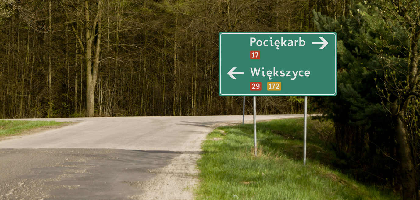
At the beginning of my work, I wanted to make new signs with a white background because and black letters because it gives the best contrast, and this solution is used in, for example, Great Britain. I realized that in Poland we have a stark winter for about 5 months, sometimes with a lot of snow everywhere, especially in smaller towns in the Polish mountains. White signs could be a huge problem because they will not differentiate from the background. I stayed with the current solution and green background on signs but to increase legibility even more I use darker green. I tried to check the signs in real sizes to find all mistakes and adjust distances between names of the city, borders and other information on the sign like arrows and the numbers of roads. I changed the place and size of road numbers in comparison to a current solution which gives a narrower sign and better architecture of information. Also on a sign where the distance in kilometres to a particular town is shown, now all information is the same size where the closest town is on the top. I redesigned the arrows because in previous versions there were two kinds of them, normal with a small arrowhead or chamfered, both can be illegible from a longer distance. I used arrows whose ends are parallel with the main stem and they are not cut of at 90 degrees which are advisable to use the ISO7001 recomendation1. In the end, I add the white border line which is thinner than in current signs.

test roadsign

Sign changes

Test

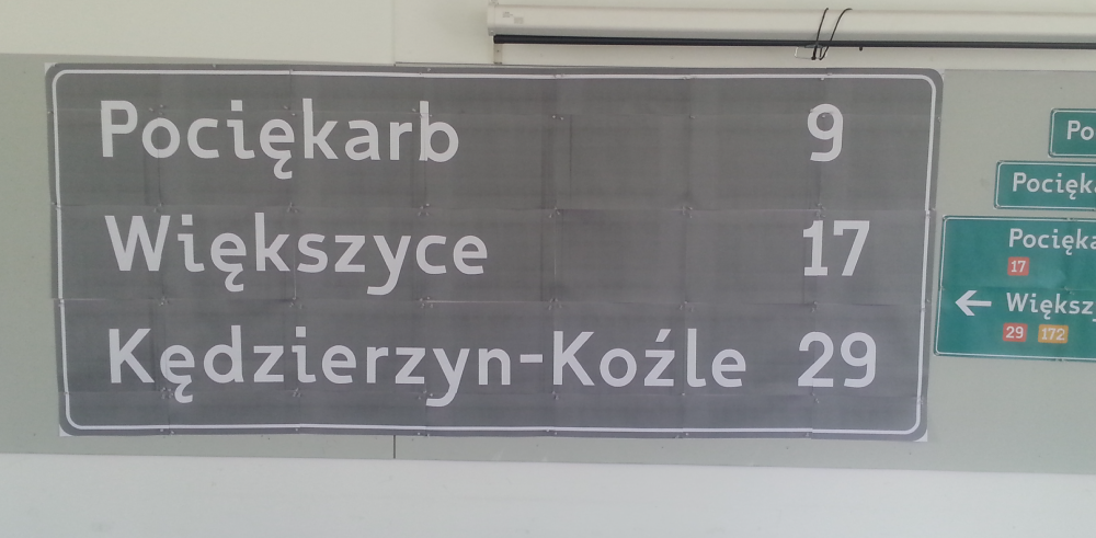
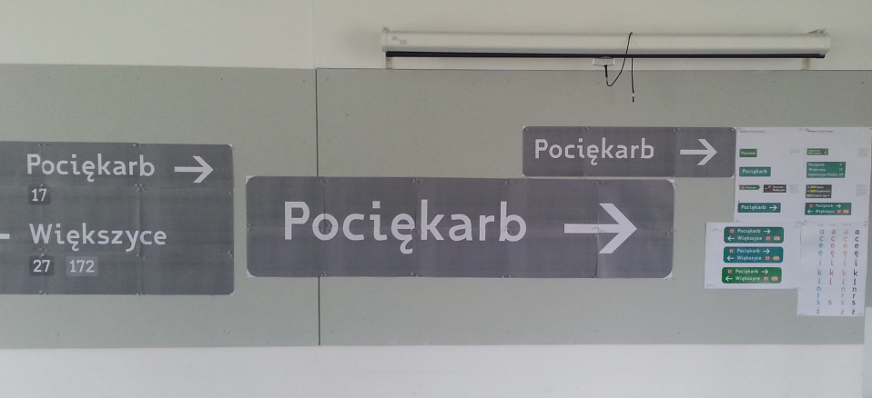
I tried to check the signs in real sizes to find all mistakes and adjust distances between names of the city, borders and other information on the sign like arrows and the numbers of roads. I changed the place and size of road numbers in comparison to the current solution which gives a narrower sign and better architecture of information.

roadsign test sign
redesigned roadsign

Concept

Redsigned signs

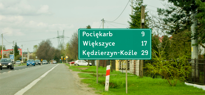
Finally, I redesigned four signs E2a and E3(showing the direction to only one city) sign in the shape of a rectangle shows the destination to the city on the junction or directly before it. And E13 in the shape of a rectangle shows the destination to the city on the junction or directly before it, also E17a means entry to the city. I decided to remove sign E1 from my project because it has a similar function to E2a. I put a lot of effort into improving the legibility of the particular letterforms which should increase legibility from a longer distance. I also tried to improve information architecture by redefining sizes and distances from particular elements. Also, I changed the colours of backgrounds for darker green and places where the number of roads is situated to achieve a better contrast of signs. Now the x-height of letters is the same on all signs, also the distances and arrows are the same what makes signs more consistent than they were before.

sign changes concept